
How to Create HVAC Charts with Google Sheets
By Rein Shope on Thursday, April 29, 2021HVAC charts give you a great way to display and analyze your data. Find out how to start making them.

Sometimes, looking at a wall of information about your HVAC company can become overwhelming; pages of numbers, dates, line items, and whatever else you’re trying to keep track of just start to blur together.
Luckily, you can very easily visualize your data using charts in Google Sheets—for free! Throughout this article, we will explore how you can turn your data into easily readable, great-looking charts through the power of Google Sheets, and other HVAC software.
Creating a Spreadsheet
Before we can start turning our data into something pretty, we have to establish our data set by either importing a spreadsheet or creating a new one. Either way, we’ll need to head to sheets.google.com.
Importing Data
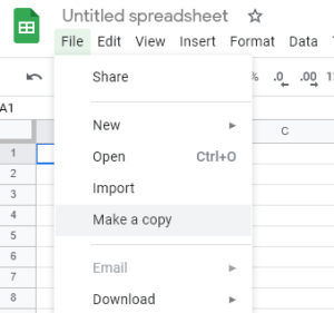
If you already have an offline spreadsheet containing the data you’d like to use, it’s as easy as clicking File and selecting Import. Google Sheets allows you to import most major file types, including those with .csv, .xls, and .xlsx extensions.
Creating a New Sheet
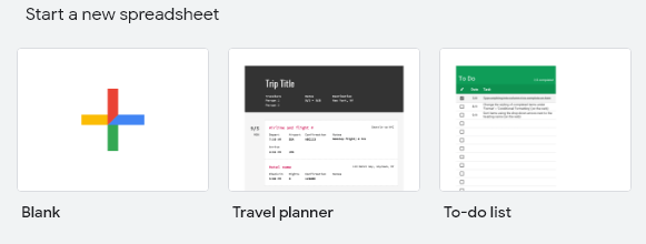
For the purposes of this article, we’ll start with a fresh spreadsheet. To do this, we will select a new Blank spreadsheet from the home screen of Google Sheets.
Easy as Piechart
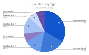
Pie charts are a great way to display your data aggregated in a disparate fashion to compare the sizes of groups. Starting from a blank spreadsheet, let’s imagine we have a list of job items your technicians used on their jobs yesterday.
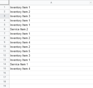
The first step is to designate what data we’ll use for the chart. If all of your data is in a single column, you can click the column header to select it in its entirety. Otherwise, you can simply click and drag from the first item to the last item.
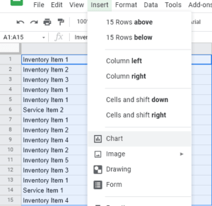
Once your data is selected, navigate to the Insert menu and select Chart. This should create a brand new pie chart and place it over your spreadsheet, already populated with the data you’ve highlighted. In the event that it does not default to a pie chart, you can double-click on the chart and select its type on the menu that appears on the right hand side of the spreadsheet.
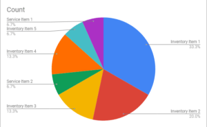
There are several options for customizing the look and feel of your new pie chart, so with just a few clicks you can style it to whatever look you’re going for!
Line Chart Dancing
Line charts (or line graphs) are another popular type of chart that’s used to represent the change of values along the course of a selected axis (most often a period of time).
For this example, let’s say we have some data that represents the amount of sales an employee has per month.
For my first column, I’m going to type in some consecutive months. You’ll notice that if you type a date in the format of 03/2021 it will automatically expand to a date format like 3/1/2021:
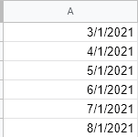
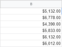
Now that my dates are populated, let’s fill in the B column with values to represent the employee’s sales for that month.
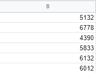
Now, for readability purposes, let’s format these numbers to display as currency. Click on the column header B, navigate to the Format menu on top, and select Number > Currency.
Now, any numbers that we input into column B will automatically display as a currency value. Just as before, we need to select the data for use in our next chart. But, this time, we need to select all of both columns. To do this, simply click on the A column header, then hold down your CTRL key while clicking on the B column header.
Once you’ve selected both columns, navigate to the Insert menu and insert a chart. This will automatically generate a line chart based on your values.
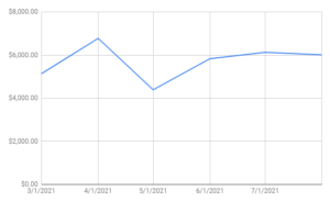
Just like the pie chart, the line chart can be easily customized by double clicking on the chart and using the right-hand customize menu.
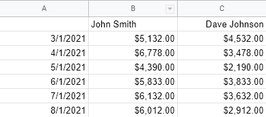
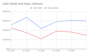
If you’d like to chart multiple employees in the same way, you simply have to fill in column C with more currency values and insert a chart after selecting all 3 columns. You can easily label each sales column by making sure the first row is filled in with the employee’s name
A Chart For Everyone
The charts don’t stop there! Google Sheets also offers area charts, bar charts, map charts, scatter charts, waterfall charts, and more! No matter what kind of data you want to work with, you’re sure to find a chart that can help you visualize and consume it in a more effective way.
Want to take your data a step further? With the HVAC software Smart Service, you can create a report for just about anything you can think of: customers, job items, revenue, commissions, and so much more!
So, hop into a spreadsheet and make your data come to life!